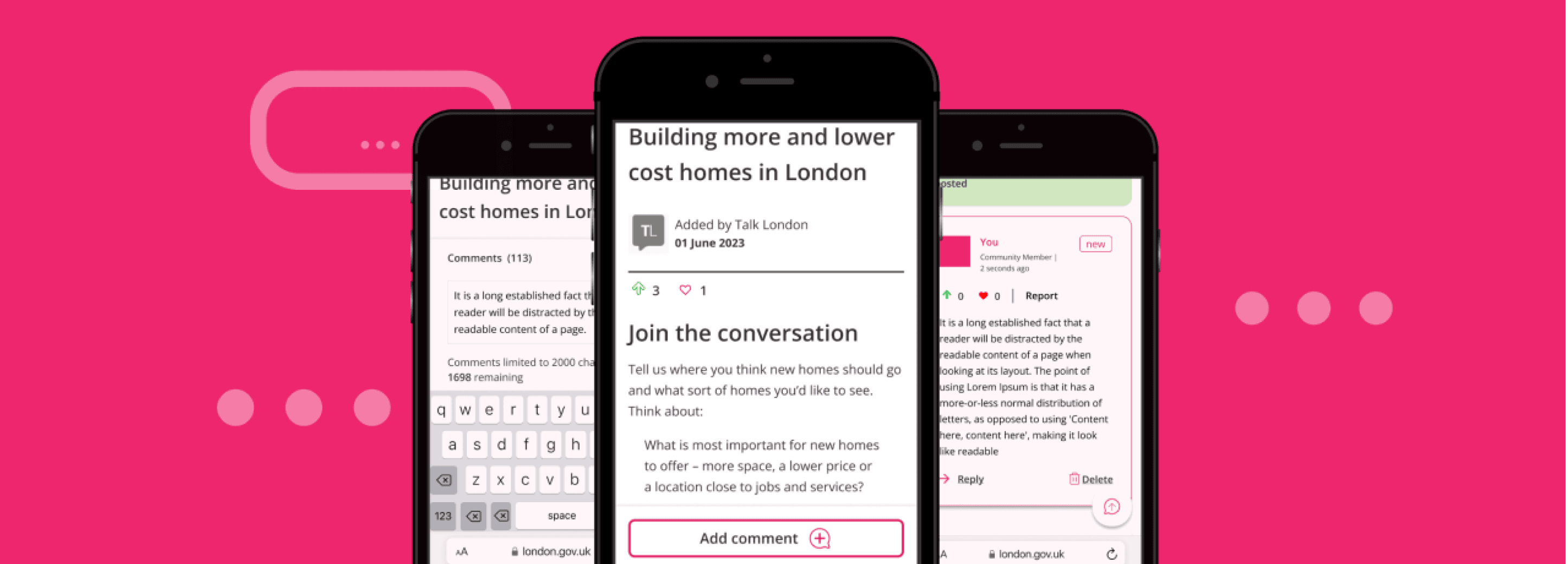
Optimise engagement user journeys for Talk London members
01 / Summary
What was delivered and how
— Services
Behavioural insight
Recruitment strategy
Remote user testing
Wireframing
— Deliverables
3 design iterations & options to A/B test
User-testing report
User-interface designs
Component library
— Outcome
I leveraged insights from usability sessions to pinpoint crucial areas for enhancement and identified potential obstacles related to commenting on forum threads.
Delivered a component library, featuring new and improved components, seamlessly integrable into their design system
02 / The hypothesis
The objective was to streamline the user journey for these users, making it easier to complete surveys, post comments, and engage with the community.The following team's concerns:
Is the engagement journey intuitive?
Uncertain if users found the journey seamless from email to survey to discussion forum, lacking clear initiative or sufficient context.
Is the site easy to navigate?
The site's navigation had multi entry points but no visual clues to inform hierarchy for members to discover related topics, forums, and engagement opportunities.
Discussion forum easy to filter?
Uncertainty regarding the understanding and value of the upvote and care functionality among Talk London members. Assessing the effectiveness of the search and filter feature in refining comment threads.
Is the page layout a barrier?
The page structure contained extensive policy information, raising concerns about its impact on members' ability to share perspectives in the discussion forum.
03 / The solution
Methodology & session outline
We conducted 11 usability testing sessions, 5 mobile, and 6 desktop.
The goal was to optimise the engagement user journey for Talk London members via email to discussion forum and find ways to increase engagement.
We employed the 'Think-aloud' usability testing protocol, where participants verbalise their thoughts while using the live Talk London Website owned by Greater London Authority.
Tests were moderated to guide users through a structured process, including:
Introductory & warm-up questions
Scenario task & feedback questions
Articulating analysis & research findings:
Articulating analysis & research findings:
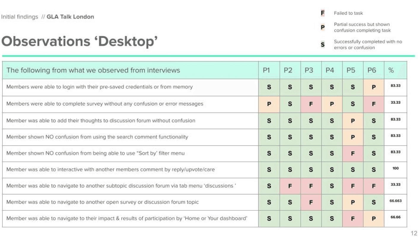
Overview of task success rate
Analysing success rates for desktop and mobile to categorise outcomes as success, failure, or partial success rates to get a comprehensive usability overview.
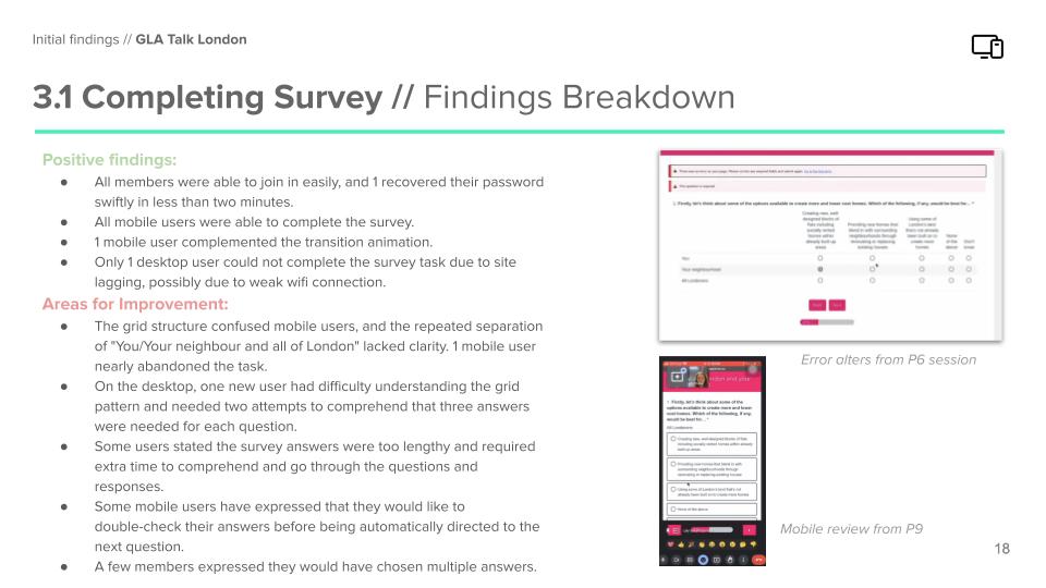
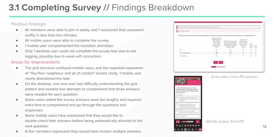
Positive & Improvement Breakdown
Features are evaluated from members' perspectives, with identified positives and areas for improvement.
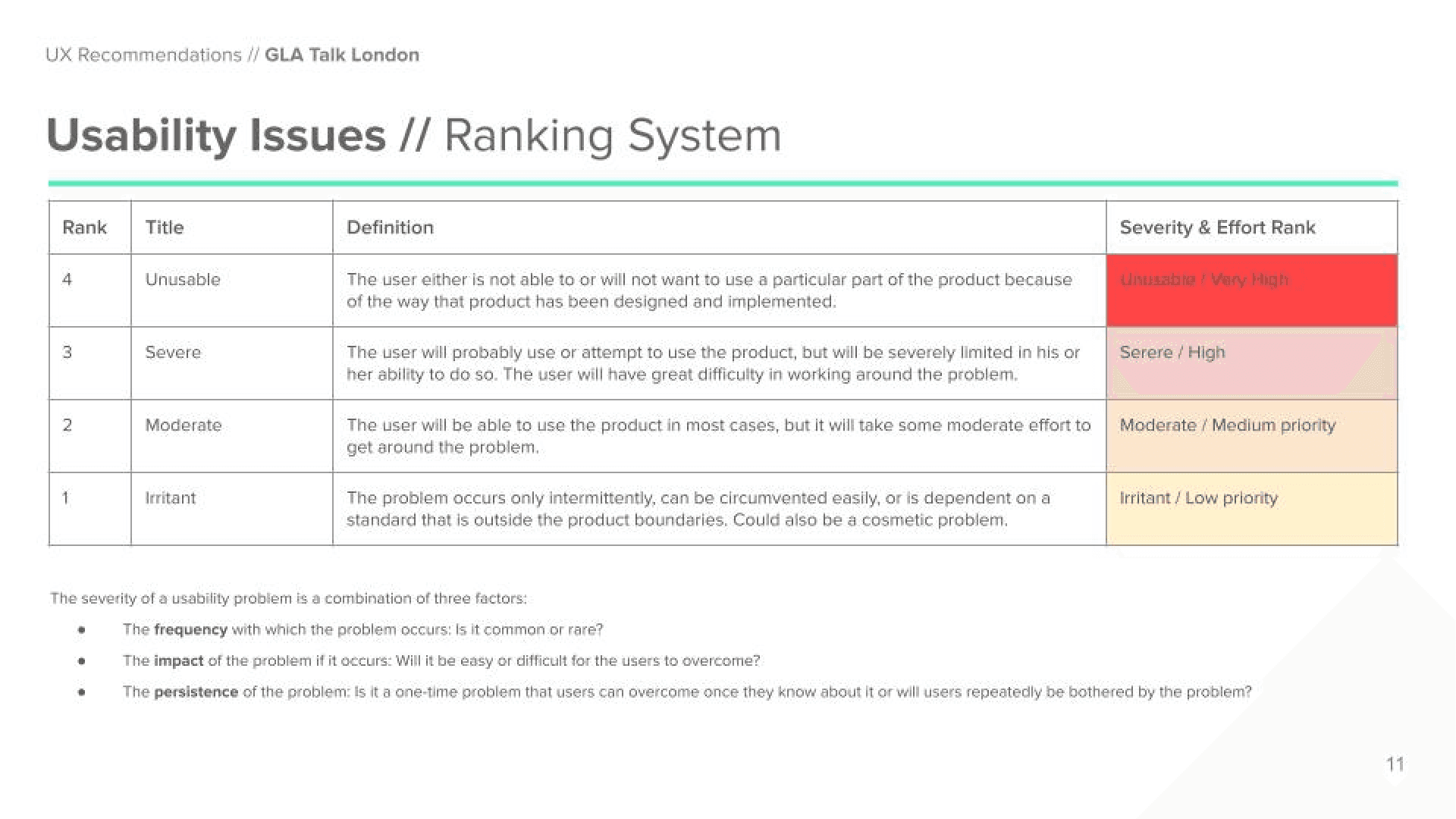
Systematic usability highlighting
Analyze and prioritize findings using a ranking system to assist product owners in drafting Jira tickets.

Overview of task success rate
Analysing success rates for desktop and mobile to categorise outcomes as success, failure, or partial success rates to get a comprehensive usability overview.

Positive & Improvement Breakdown
Features are evaluated from members' perspectives, with identified positives and areas for improvement.

Systematic usability highlighting
Analyze and prioritize findings using a ranking system to assist product owners in drafting Jira tickets.
04 / Outcomes:
Examples key problems solved:
Deliverable 1 / Updating site structure and incorporating breadcrumbs
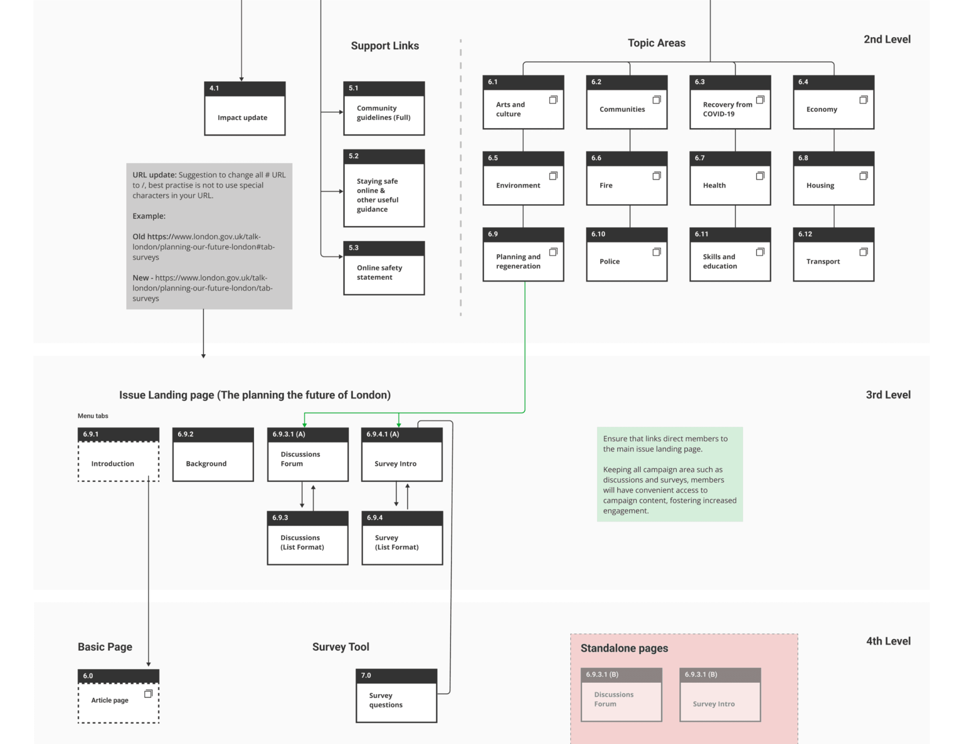

Usability sessions revealed navigational challenges due to duplicated pages, leading to dead-end user journeys. Addressed by creating a site map and incorporating breadcrumbs for enhanced site structure.
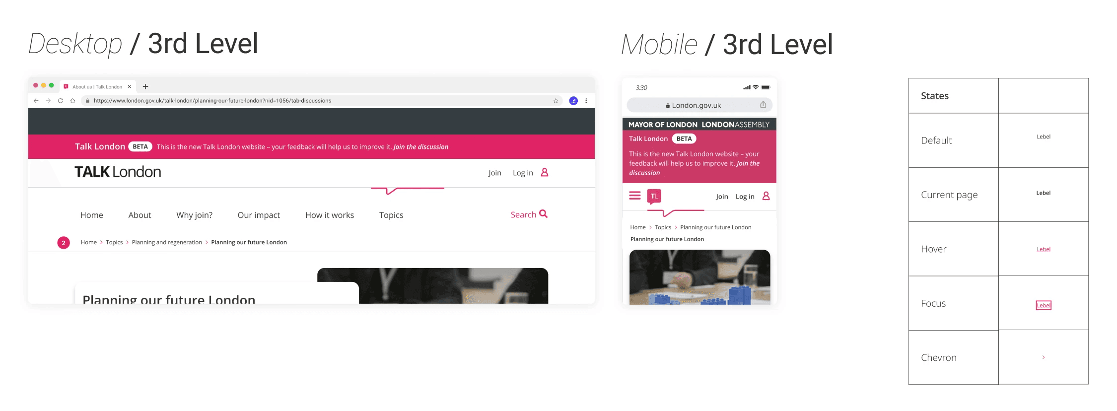

Visualised breadcrumb levels and utilised existing code from the London Mayor website
Deliverable 2 / Remove or reduce the effort required to post a comment
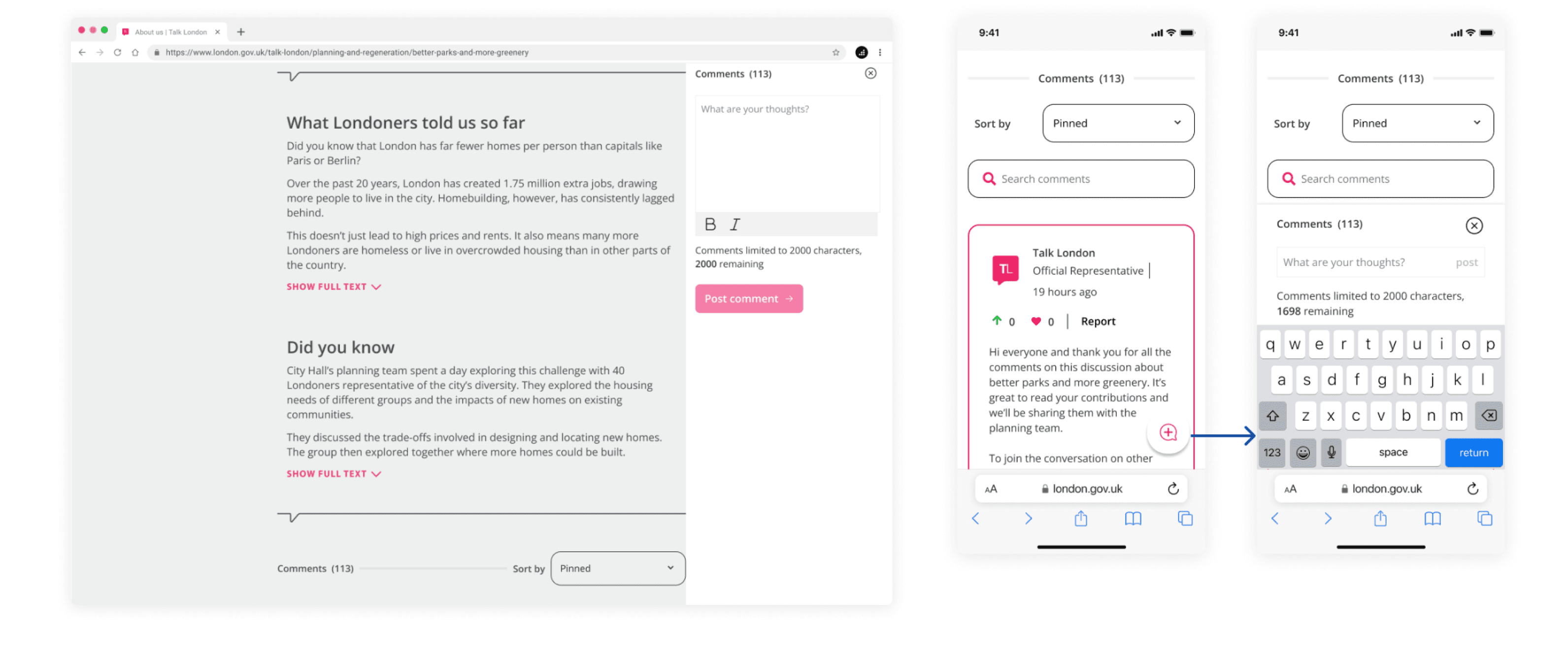
Option 1 (Recommended) / Quick access comment feature: floating CTA button opens bottom sheet on mobile, right-hand panel on desktop.
Advantages
Members can easily access writing out posts from anywhere, allowing them to seize the moment when inspiration strikes.
No scrolling effect is necessary, which members weren't fond of.
Disadvantage
Creating the transaction button effect requires implementing the necessary animation.
Members will not be directed to the policy team's contextual information and might need to scroll back to access the questions promptly.
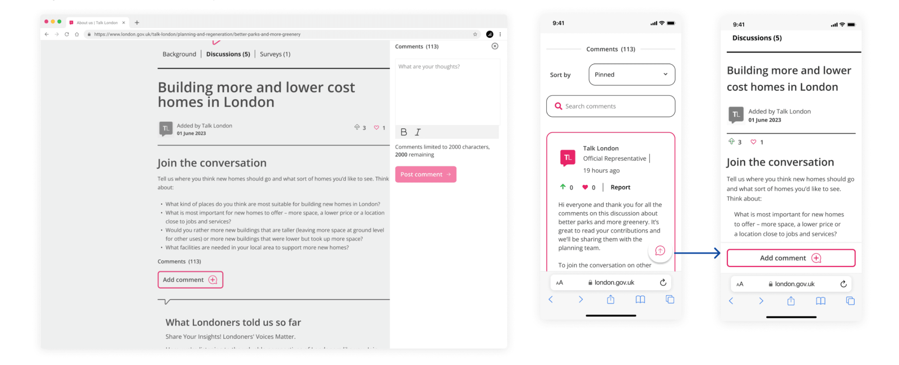
Option 2 / Back-to-top arrow. Selecting the CTA scrolls the user back to the top of the page, providing convenient access to the 'Add comment' feature.
Advantages
Quick access to policy team's contextual information before writing up response, no scrolling effort required.
Members may be very familiar with this function from other websites.
Disadvantage
Additional step is required form members to begin writing out a response.
The scrolling effect is necessary, which members weren't fond of.

Option 3 / Back-to-top arrow. Selecting the CTA scrolls the user back to the top of the page, providing convenient access to the comment box.
Advantages
Contents can be displayed full width on Desktop in in-page text box.
1 less step than option 2.
Disadvantage
Members can’t see prompt questions while typing out response.
The scrolling effect is necessary, which members weren't fond of.
Deliverable 3 / Enhanced page structure to foster a welcoming and informative environment
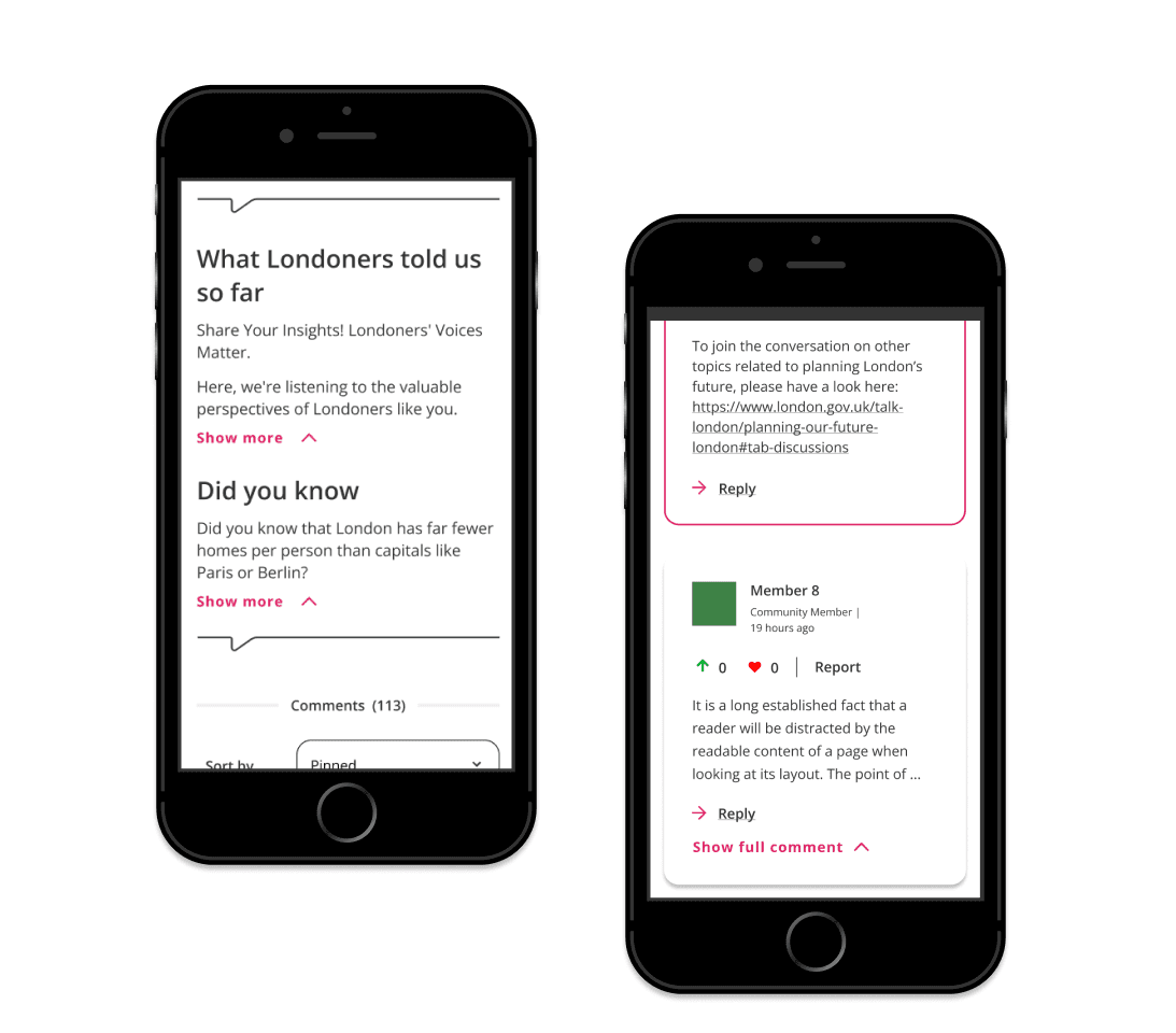

Updated page structure:
Develop a discussion layout that promotes inclusivity and provides essential information without overwhelming members by applying accordions to policy information and members comments.
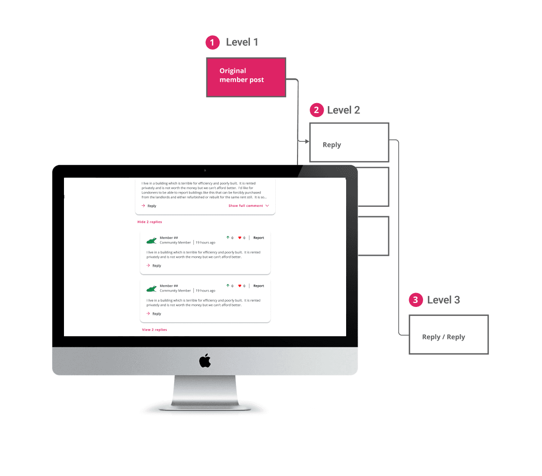

Comments thread:
Some members found the comment thread list difficult to follow, prompting the initial phase of improvements. Enhanced visibility by highlighting the number of corresponding comments and adding labels. Limited replies to three for clarity.

Option 1 (Recommended) / Quick access comment feature: floating CTA button opens bottom sheet on mobile, right-hand panel on desktop.
Advantages
Members can easily access writing out posts from anywhere, allowing them to seize the moment when inspiration strikes.
No scrolling effect is necessary, which members weren't fond of.
Disadvantage
Creating the transaction button effect requires implementing the necessary animation.
Members will not be directed to the policy team's contextual information and might need to scroll back to access the questions promptly.
Client review:
“Increase in the conversion rates for members, from clicking on emails to participating onsite by taking surveys, using micro-interactions, and adding comments and ideas.
The team was calm, diligent, and very can-do. We really appreciated that they delivered what they said they would and there was never any drama. It was really nice to work with an agency who were so helpful, collaborative and competent.
Some design recommendations already build and making a difference and new features in the pipeline and will be A/B tested.” -
From Selina Holliday Head of Digital Engagement of Greater London Authority
01 / Summary
What was delivered and how
— Services
Behavioural insight
Recruitment strategy
Remote user testing
Wireframing
— Deliverables
3 design iterations & options to A/B test
User-testing report
User-interface designs
Component library
— Outcome
I leveraged insights from usability sessions to pinpoint crucial areas for enhancement and identified potential obstacles related to commenting on forum threads.
Delivered a component library, featuring new and improved components, seamlessly integrable into their design system
Optimise engagement user journeys for Talk London members for the GLA
01 / The problem
The objective was to streamline the user journey for these users, making it easier to complete surveys, post comments, and engage with the community.The following team's concerns:
Is the engagement journey intuitive?
Uncertain if users found the journey seamless from email to survey to discussion forum, lacking clear initiative or sufficient context.
Is the site easy to navigate?
The site's navigation had multiple entry points but no visual clues to inform hierarchy for members to discover related topics, forums, and engagement opportunities.
Discussion forum easy to filter?
Uncertainty regarding the understanding and value of the upvote and care functionality among Talk London members. Assessing the effectiveness of the search and filter feature in refining comment threads.
Is the page layout a barrier?
The page structure contained extensive policy information, raising concerns about its impact on members' ability to share perspectives in the discussion forum.
Zohrane ⏤ 2024
04 / Outcomes
Examples key problems solved:
Deliverable 1 / Updating site structure and incorporating breadcrumbs
Usability sessions revealed navigational challenges due to duplicated pages, leading to dead-end user journeys.
Addressed by creating a site map and incorporating breadcrumbs for enhanced site structure.

Visualised breadcrumb levels and utilised existing code from the London Mayor website.

Deliverable 2 / Remove or reduce the effort required to post a comment

Option 1 (Recommended) / Quick access comment feature: floating CTA button opens bottom sheet on mobile, right-hand panel on desktop.
Advantages
Members can easily access writing out posts from anywhere, allowing them to seize the moment when inspiration strikes.
No scrolling effect is necessary, which members weren't fond of.
Disadvantage
Creating the transaction button effect will involve implementing the required animation.
Members will not be directed to the policy team's contextual information and might need to scroll back to access the questions promptly.
Deliverable 3 / Enhanced page structure to foster a welcoming and informative environment
Updated page structure:
Develop a discussion layout that promotes inclusivity and provides essential information without overwhelming members by applying accordions to policy information and members comments.

Comments thread:
Some members found the comment thread list difficult to follow, prompting the initial phase of improvements. Enhanced visibility by highlighting the number of corresponding comments and adding labels. Limited replies to three for clarity.


03 / The solution
Articulating analysis & research findings:

Overview of task success rate
Analysing success rates for desktop and mobile to categorise outcomes as success, failure, or partial success rates to get a comprehensive usability overview.
Positive & Improvement Breakdown
Features are evaluated from members' perspectives, with identified positives and areas for improvement.
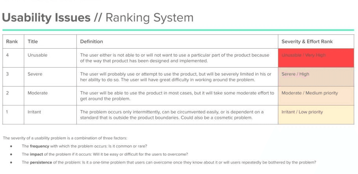
Systematic usability highlighting
Analyze and prioritize findings using a ranking system to assist product owners in drafting Jira tickets.
Methodology & session outline
We conducted 11 usability testing sessions, 5 mobile, and 6 desktop.
The goal was to optimise the engagement user journey for Talk London members via email to discussion forum and find ways to increase engagement.
We employed the 'Think-aloud' usability testing protocol, where participants verbalise their thoughts while using the live Talk London Website owned by Greater London Authority.
Tests were moderated to guide users through a structured process, including:
Introductory & warm-up questions
Scenario task & feedback questions
“Increase in the conversion rates for members, from clicking on emails to participating onsite by taking surveys, using micro-interactions, and adding comments and ideas.
The team was calm, diligent, and very can-do. We really appreciated that they delivered what they said they would and there was never any drama. It was really nice to work with an agency who were so helpful, collaborative and competent.
Some design recommendations already build and making a difference and new features in the pipeline and will be A/B tested.” -
From Selina Holliday Head of Digital Engagement of Greater London Authority
Client review:
Zohrane ⏤ 2024